|
Choose: |
|
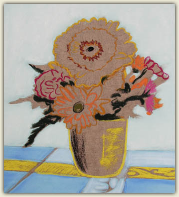
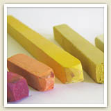
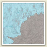
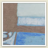
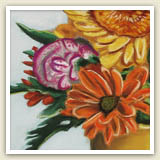
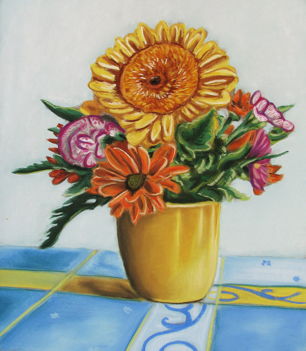
Still Life of Flowers, Thaneeya McArdle, 2009. Pastel artwork typically has a rich, velvety, almost luminous appearance. |
|
Pastels are comprised of pure pigment and a binder, which results in a sense of immediacy and purity of color in pastel artwork. Pastels are an excellent medium for capturing texture and energy, whether it’s the soft fur of a cat, golden light falling upon haystacks in an amber field, or the movements and costumes of ballet dancers.
What is Pastel?
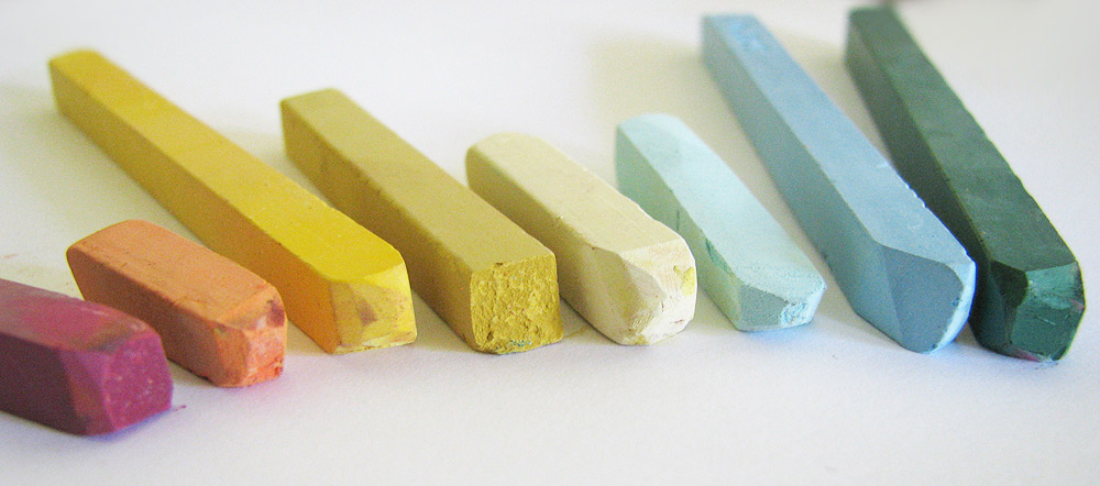
Pastels are usually in stick form, similar to chalk. A pastel stick consists of pure powdered pigment and an inert binder, such as gum arabic, gum tragacanth, or methyl cellulose. Pastels have a higher pigment concentration than any other artist medium (hence the rich, luminous colors that pastels can achieve). The powdered pigments used in pastels are similar to those found in oil paints.
Pastels can be hard or soft. Soft pastels have more pigment and less binder, so they are easier to smudge and have brighter colors. Hard pastels have less pigment and more binder than soft pastels. Hard pastels can stay relatively sharp, so they are ideal for pastel artwork that requires tight detail.
Pastel artwork can either be referred to as a “pastel”, a “pastel painting”, or a “pastel drawing”. What is the difference between a pastel painting and a pastel drawing?
A pastel painting refers to a pastel artwork in which the paper is fully covered in pastel. If the surface of the paper is not totally covered in pastel and some of the paper underneath shows though, then it is referred to as a pastel drawing.
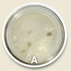
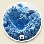
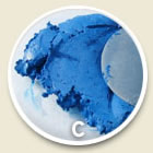
Making your own pastels is a bit more complicated than making acrylic paints or watercolor paints, but overall it is still a fairly easy process. Here are the steps to making your own pastels:
Listen: The artist talks about making pastels.
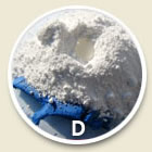
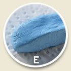
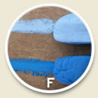
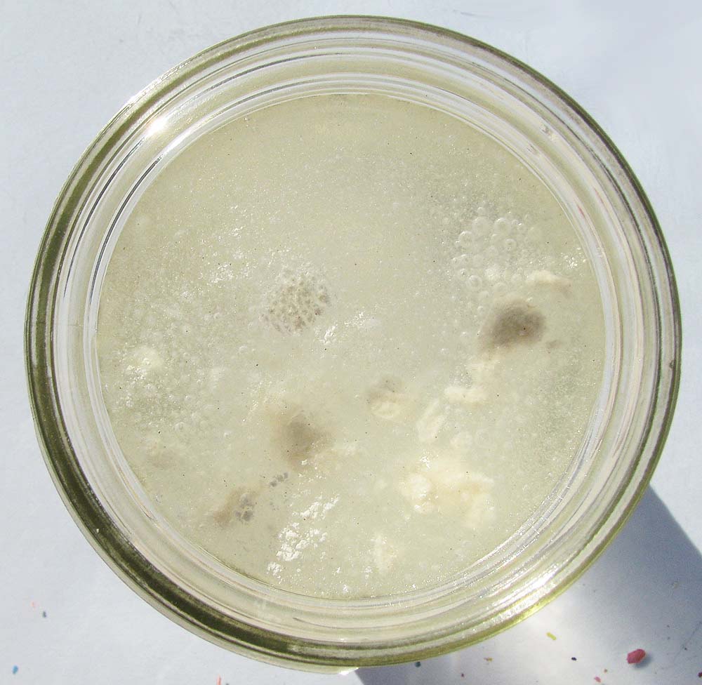
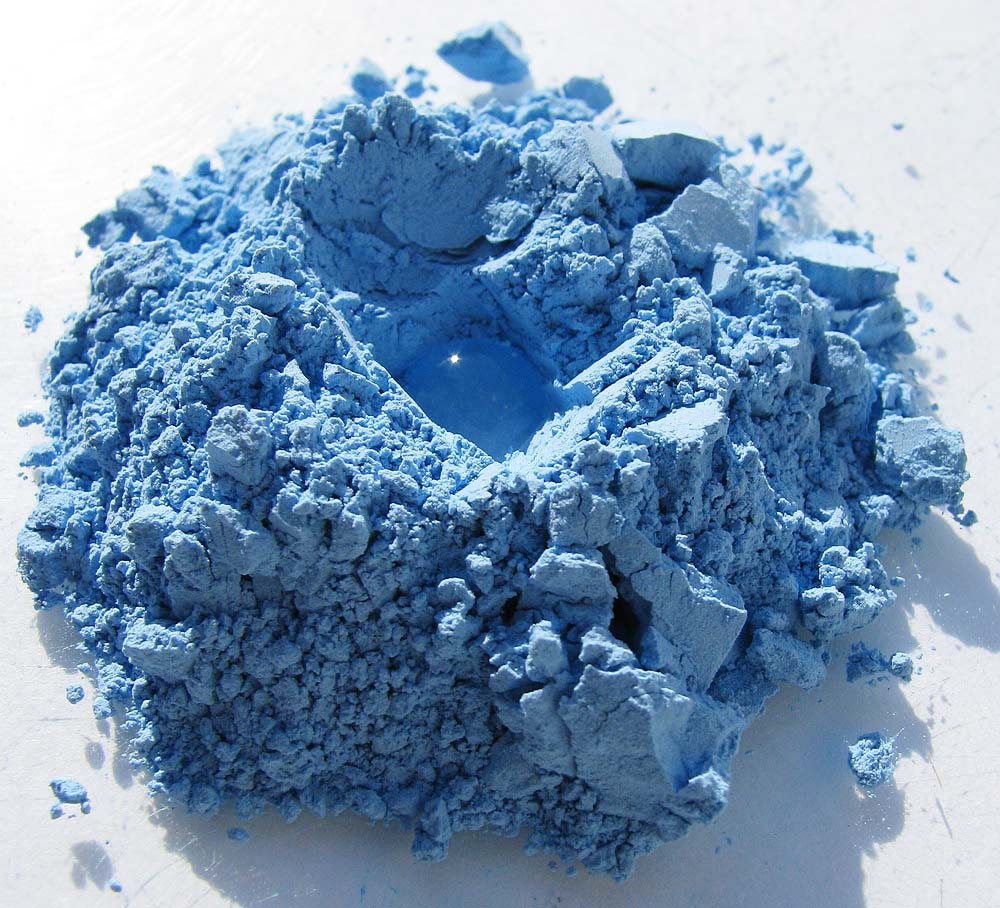
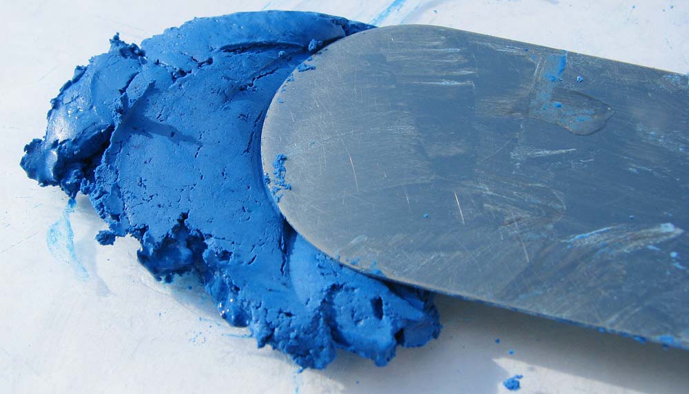
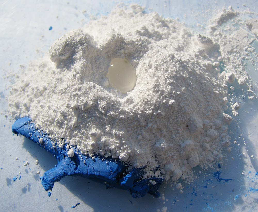
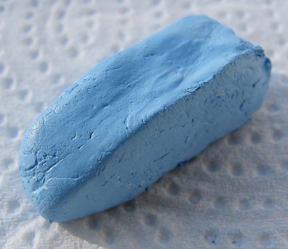
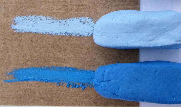
(A) Place powdered gum tragacanth into a glass jar, add water and mix to dissolve. The ratio is typically 1 part gum tragacanth to 30 parts water. Close the jar and refrigerate it for at least 48 hours. The mixture will become a gelatinous solution. (B) Place powdered pigment on a glass palette. Make a hole in the middle of the pile of pigment. Pour a very small amount of the gum tragacanth solution into the center of the pigment. Using a palette knife, mix the pigment and the gum tragacanth solution. (C) If necessary, add more gum solution. Mix thoroughly until the mixture reaches a doughy consistency. (D) To make a lighter shade of blue, add a pile of white pigment to the remaining blue pastel. Add a small amount of gum tragacanth, and repeat the mixing process. (E) Mold the doughy pastel into a stick form. Place the pastel on absorbent paper, such as a paper towel. Allow the pastel to dry (typically 24-48 hours). You can create your pastels in any shape that you want, depending on what you might want to use it for. (F) The dried pastels and the marks that they make on abrasive paper.
Blending Pastel
Unlike acrylics and watercolors, which are mixed and blended on the palette before being applied to the paper or the canvas, pastels are blended directly on the paper itself. Pastels can be blended in a variety of ways, such as blending with a finger, a tortillon, a Q-tip, a cloth, or a special pastel blending tool that is designed specifically for blending pastels.
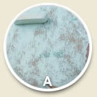

Listen: Dirty hands and pastels.
(A) A layer of pastel is applied to the paper, using the side of the pastel. Loose pastel particles are visible on the surface of the paper. (B) A layer of pastel before it is blended, followed by an image showing how it looks after just over half of the layer of pastel has been blended. (C) This photo shows the process of the pastel being blended with a finger, which is the most common technique for blending pastel. (D) A layer of white pastel has been applied over top of the blended light blue pastel. It is then smoothly blended with the bottom layer of pastel.
Next, explore how a pastel painting is created, from start to finish! We’ll examine several different techniques that artists use to create pastel artwork. In this demonstration, we used NuPastel by Prismacolor, which is a hard pastel – excellent for detail. The abrasive paper has a strong tooth, which catches the pastel pigments as the pastel moves across the surface of the paper.
|
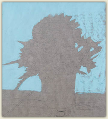
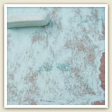
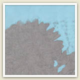
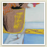
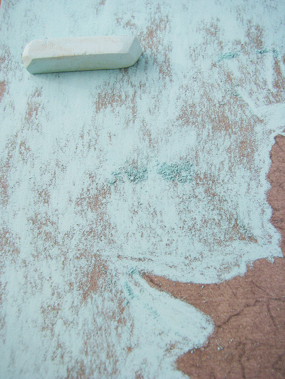
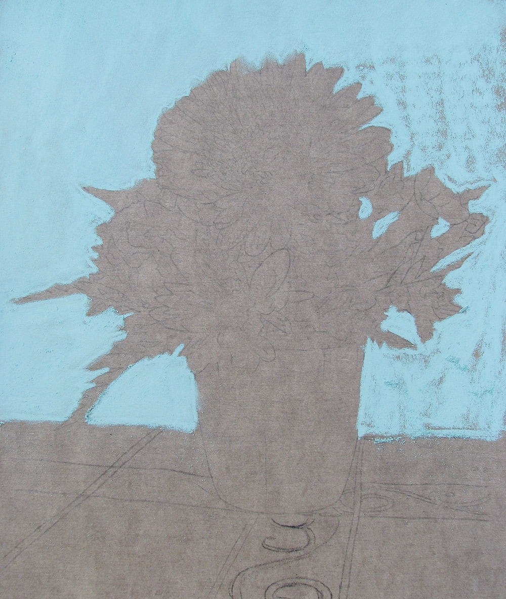
Outlining the background makes it easier to work on the foreground. When filling in a large background area with color, artists will usually use one color at a time. If more than one color is necessary, it is blended in later. |
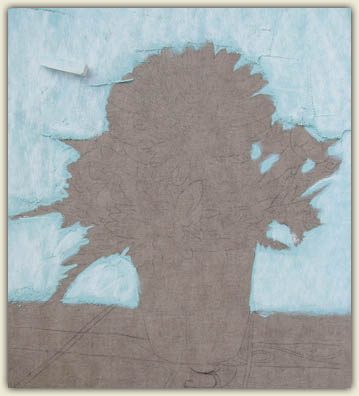
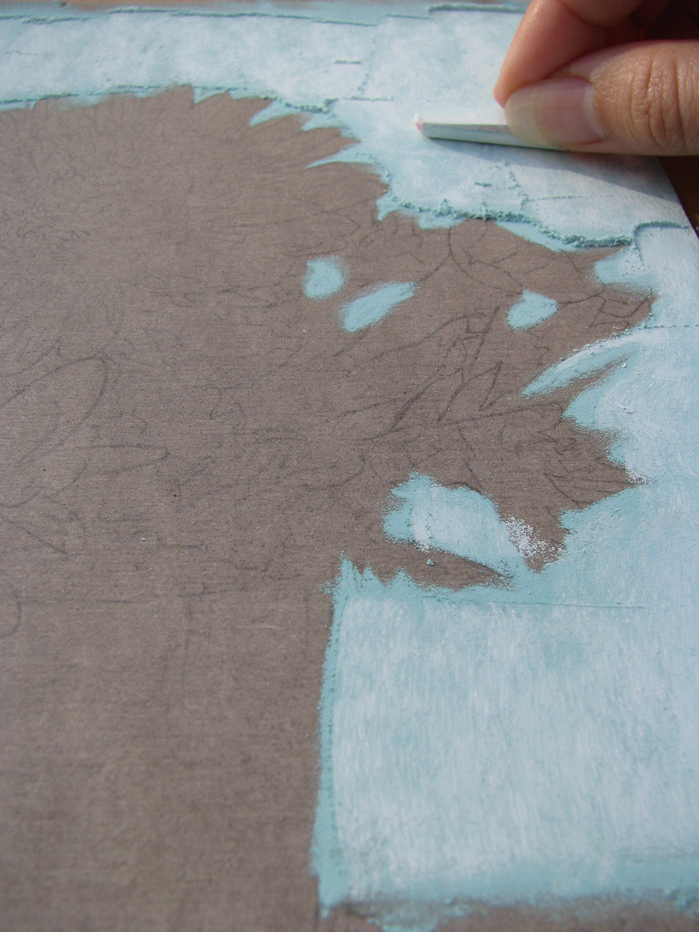
In this close-up you can see the loose pastel particles on the surface of the paper. Most of the pastel rests in the tiny grooves of the paper, but the excess rests upon the surface. The excess pastel particles need to be either gently blown or tapped away. |
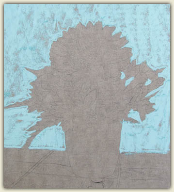
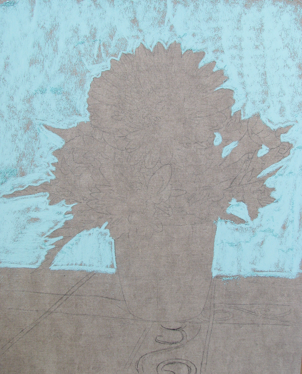
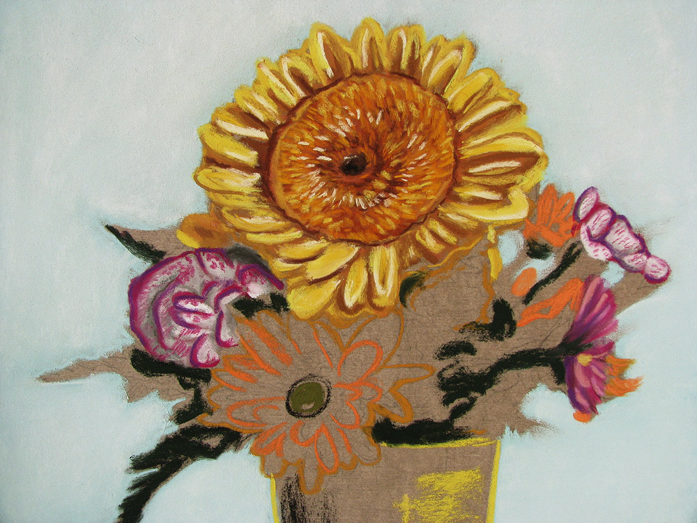
Outlines & Background
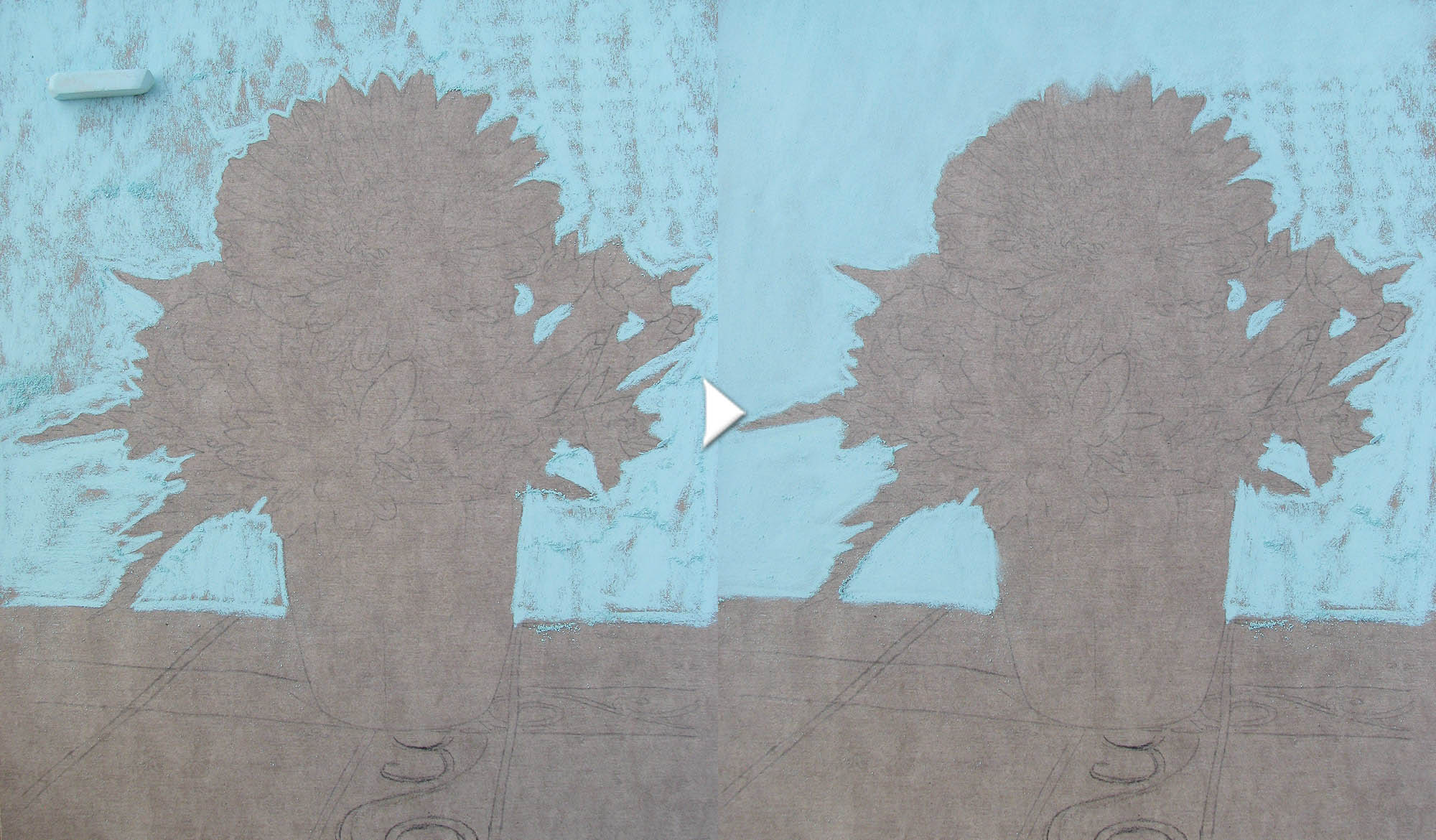
The first step in creating this pastel painting was to lightly draw the outline of the still life in graphite. This same first step is also used to create realistic watercolor and acrylic paintings.
A light blue pastel was then used to block in the outline of the flowers and vase. The edge of the pastel was used to delineate the detailed outline closest to the flowers, while the flat side of the pastel was used for the broad application of filling in the background. Using the flat side of the pastel is a common technique for quickly filling in vast areas of color.
|
In this image, you can easily see which side has been smudged and which side has not been smudged. Do you prefer the look of the smoother side, or of the rougher side? |
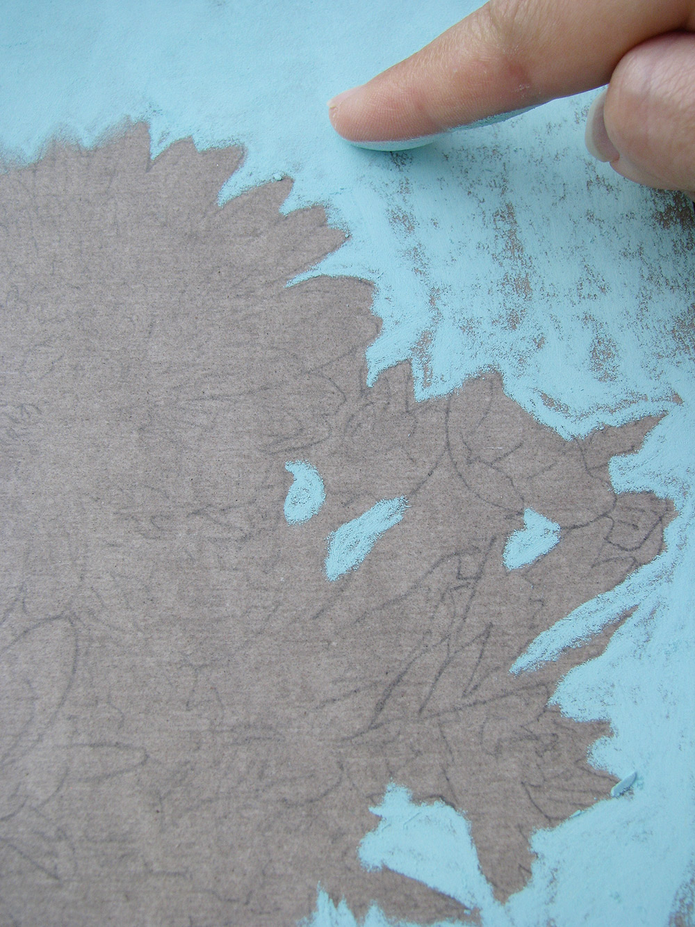
This image demonstrates how the finger can be used to rub and smooth pastels. This is just one of many ways that pastels can be smudged. |
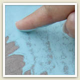
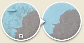
Smudging & Rubbing
Pastels on the paper can either be left as is, or they can be rubbed to make the surface appear smoother. Rubbing or smudging the pastel is ideal if you want to create a gradual blend of colors. Sometimes leaving the pastel as is (not rubbing or smudging) can be desirable also, because the resulting artwork will have a different energy and appearance. Oftentimes, artists use a combination of rubbed and unrubbed pastel to create their artwork. Can you think of which subjects would look best when smoothly blended? Which subjects would benefit from being left in a raw, unsmudged state?
|
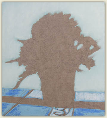
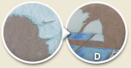
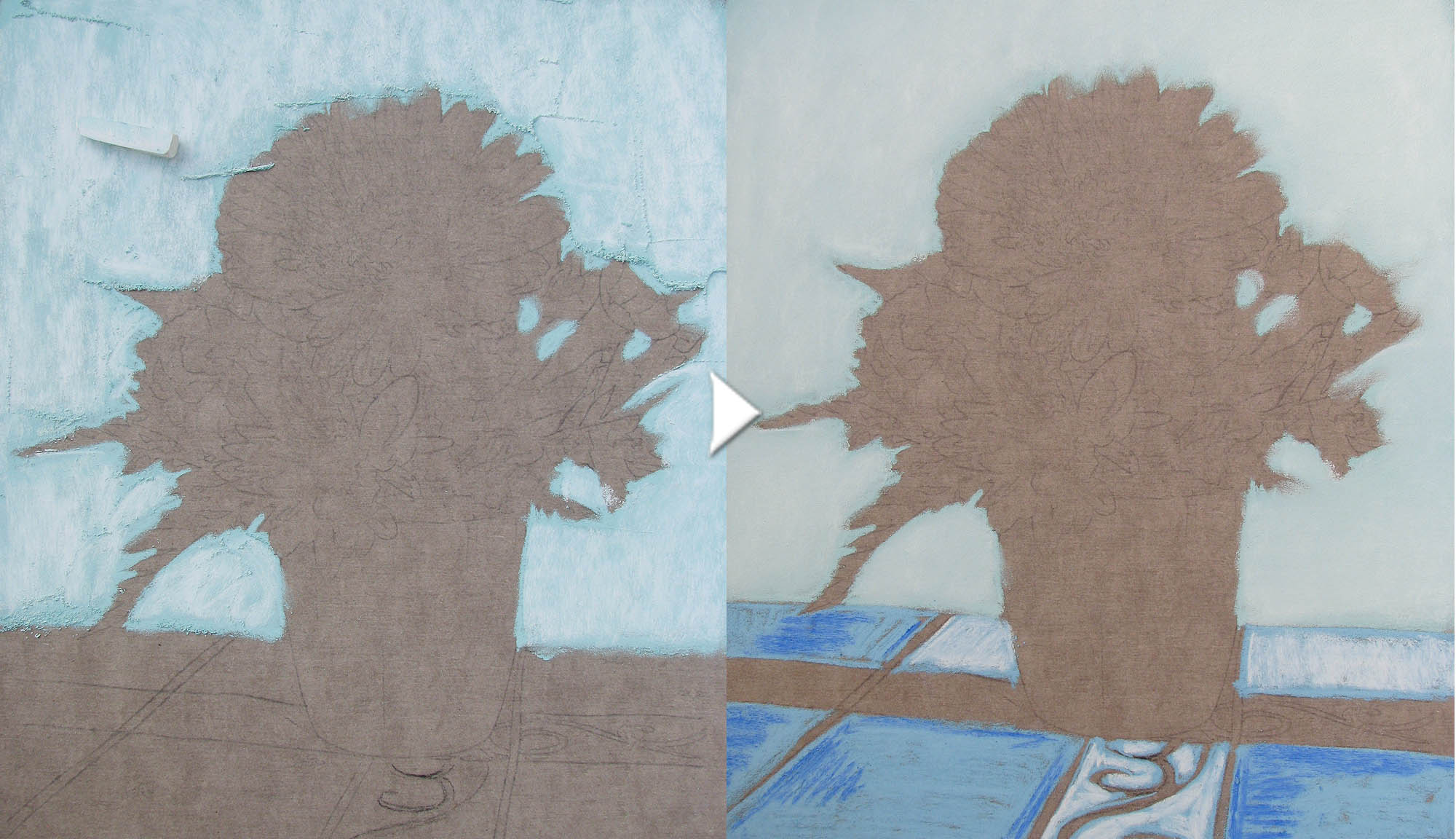
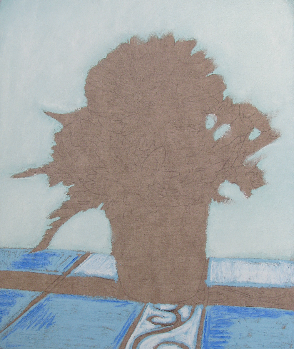
This image shows white pastel added over the first layer of turquoise blue, which both brightens the background color and makes it more interesting. In this picture you can clearly see the small piles of excess pigment that rest upon the paper before being blown or tapped away. |
The layer of white is rubbed in to the previous layer of blue, creating a light blue that has subtle variations in hue and value throughout the background. Here you can also see another example of layering on the tablecloth, in which pastel is added to the new layer before the previous layer has been rubbed smooth. |
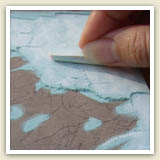
Layering Colors
Another technique of pastel painting is to layer a color over top of a previous layer of color to achieve a new color that is richer and/or more varied in appearance. This can also create a depth to the artwork. Similar techniques can be used when creating acrylic or watercolor paintings.
After adding a new layer of pastel, you can choose to blend the top layer or to leave the new layer as is.
In the images to the left, you can see an example of white pastel being added over top of light blue pastel. Layering colors allows you to get a specific color that you may not have in your set of pastel sticks.
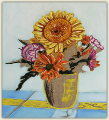
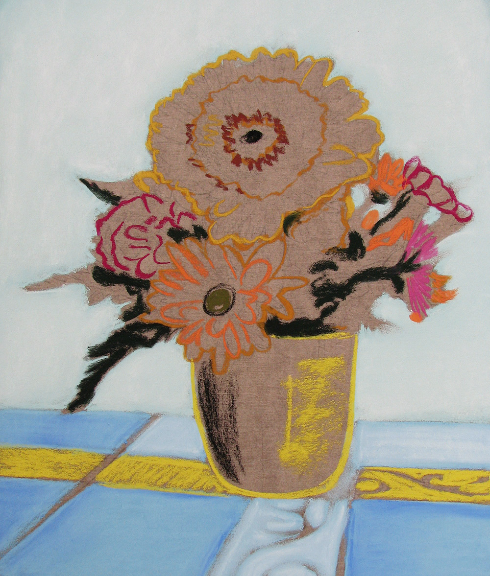
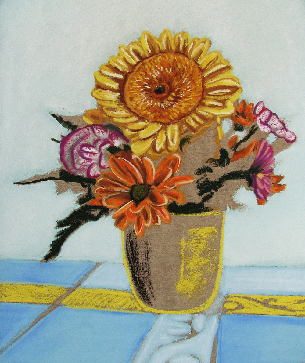
Identifying Main Forms
The important step now is to outline the flowers and the vase with the main colors, which helps define the different forms. This helps you know “where you are” in the composition artwork, and forms the backbone for more layers of pastel.
In the image to the right, you can see how the outlines of the flowers have been added. At this point, a limited number of colors are used to make a limited number of lines. The purpose is to quickly capture the main idea of the image. Details will be gradually added later.
In addition to demarcating the main outlines of the flowers, it is also helpful to identify certain areas that share the same hue or value. In this case, it was helpful to identify the dark areas of the leaves and to quickly make marks in those dark areas. This technique is also helpful when creating an acrylic painting.
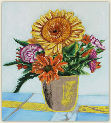
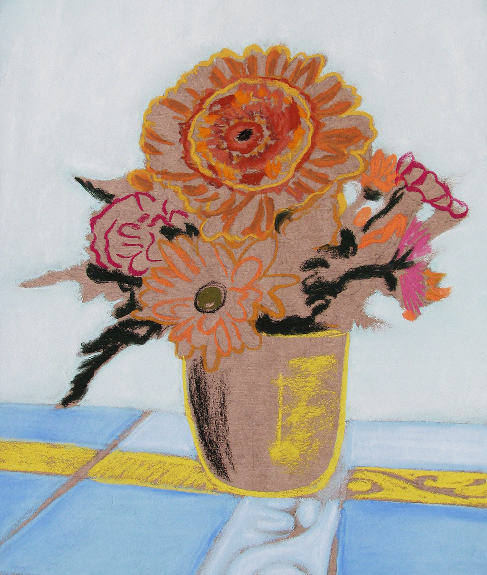
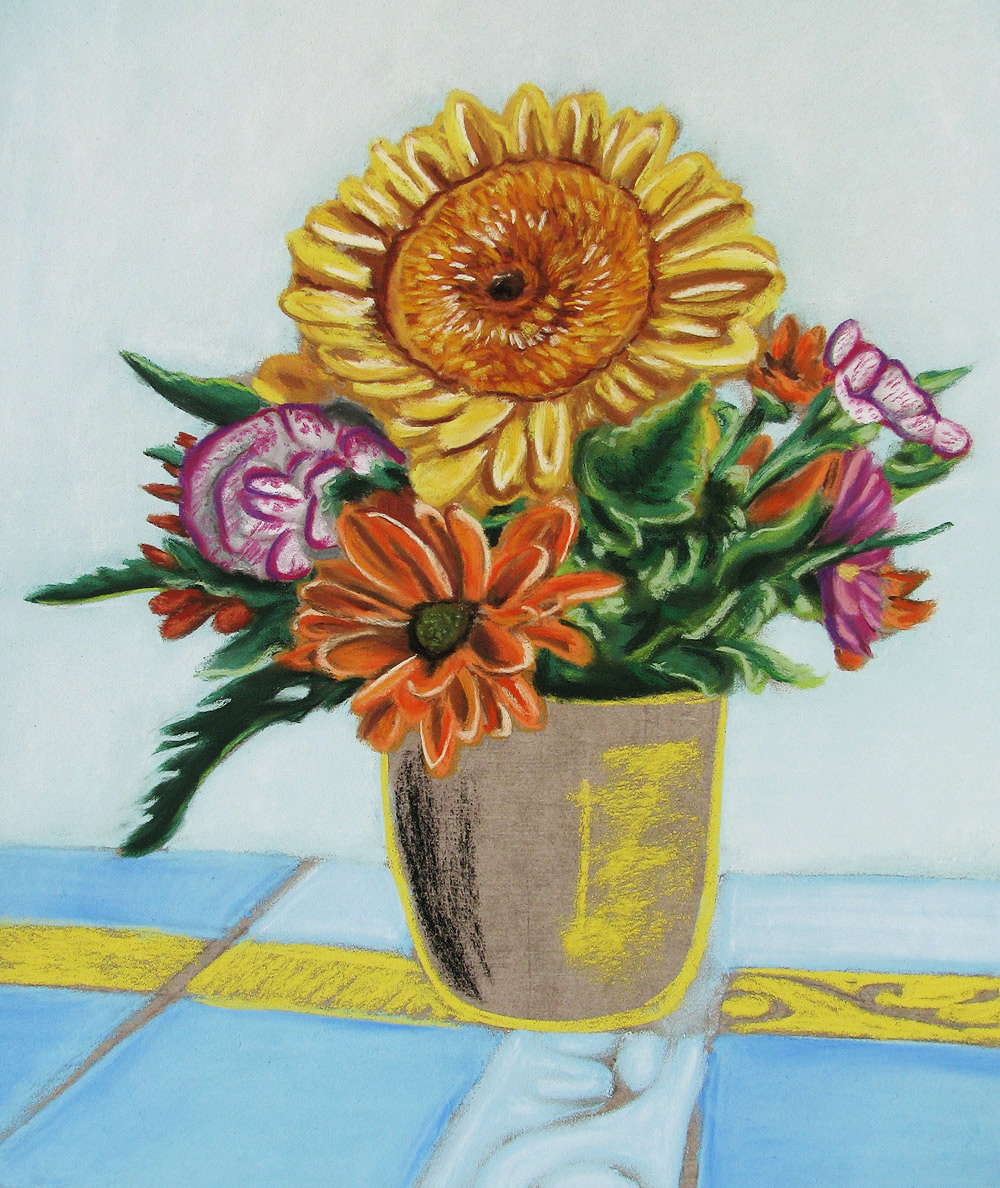
Adding Details
With the main ideas of the composition outlined, the next step is to work on the details. Any colors that are applied will form the foundation for future layers of color.
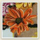
More layers of pastel are added to the gerbera daisy. Some of the bottom layers are blended, but the top layers will remain unblended. This creates an image that often has a richer depth and higher emotional impact than it would if the pastels were blended. Not blending colors is a good technique for creating texture and energy in a pastel artwork. Can you imagine how this gerbera daisy would look different if the colors were all blended?
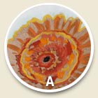
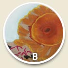
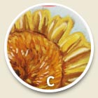
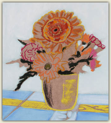
(A) More colors have been added to the main yellow gerbera daisy, which will be blended before more pigment is added. (B) The colors of the gerbera daisy have been blended. It is now ready for more layers and more details.(C) The pigments forming the gerbera daisy have been layered to complete the flower.
|
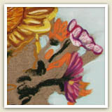
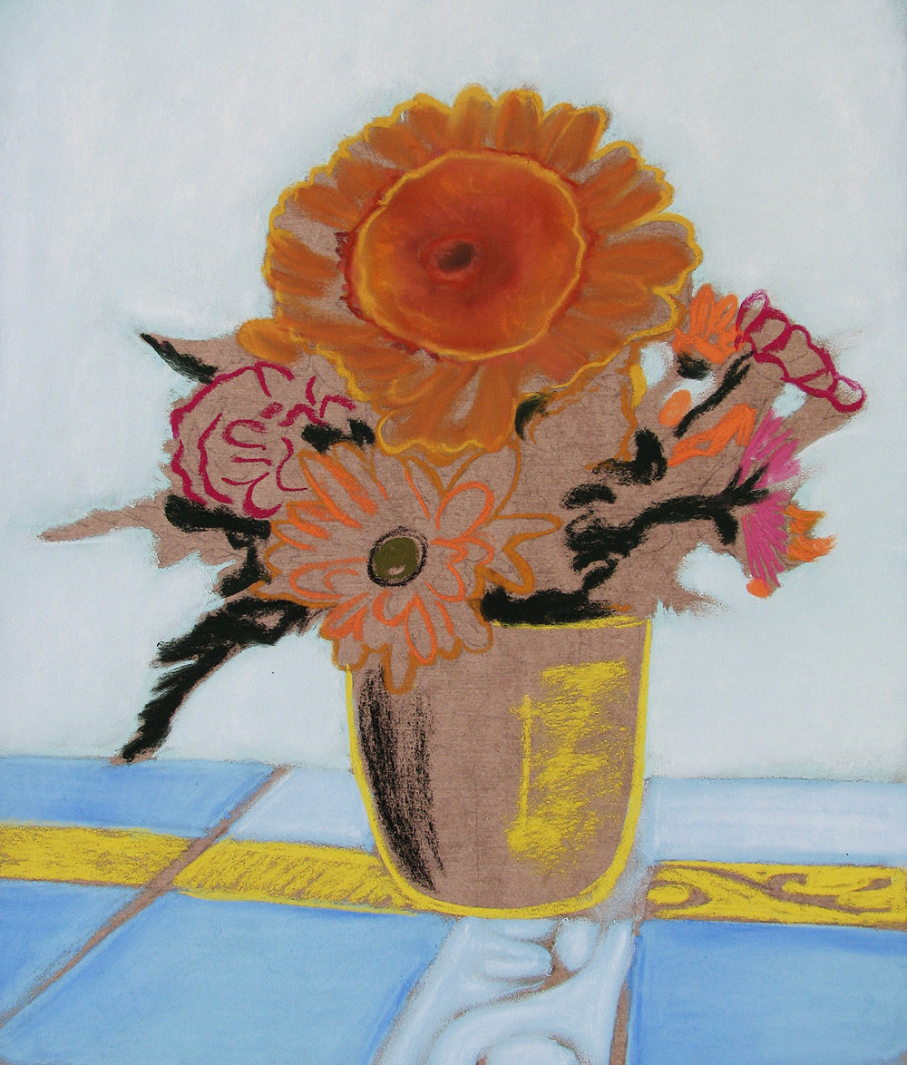
The white/magenta flowers have been finished to completion. |
With the white/magenta flowers completed, the next color group to work on is the group of orange flowers. |
|
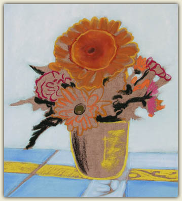
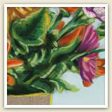
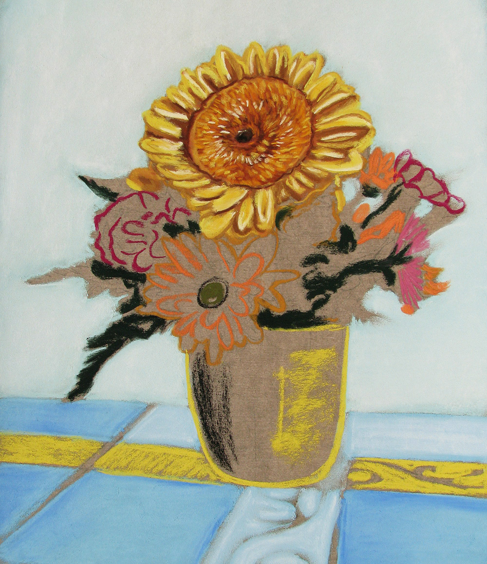
Next, the green leaves are filled in and brought to completion. |
With the flowers completed, the next area to tackle is the vase. |
|
Listen: Fixing a pastel painting. |
|
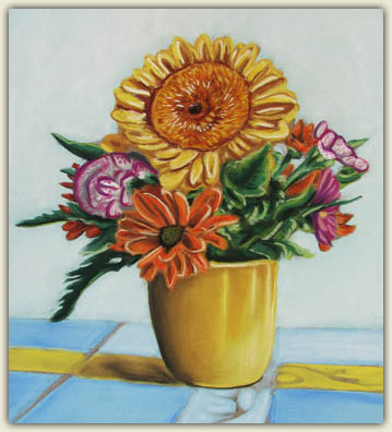
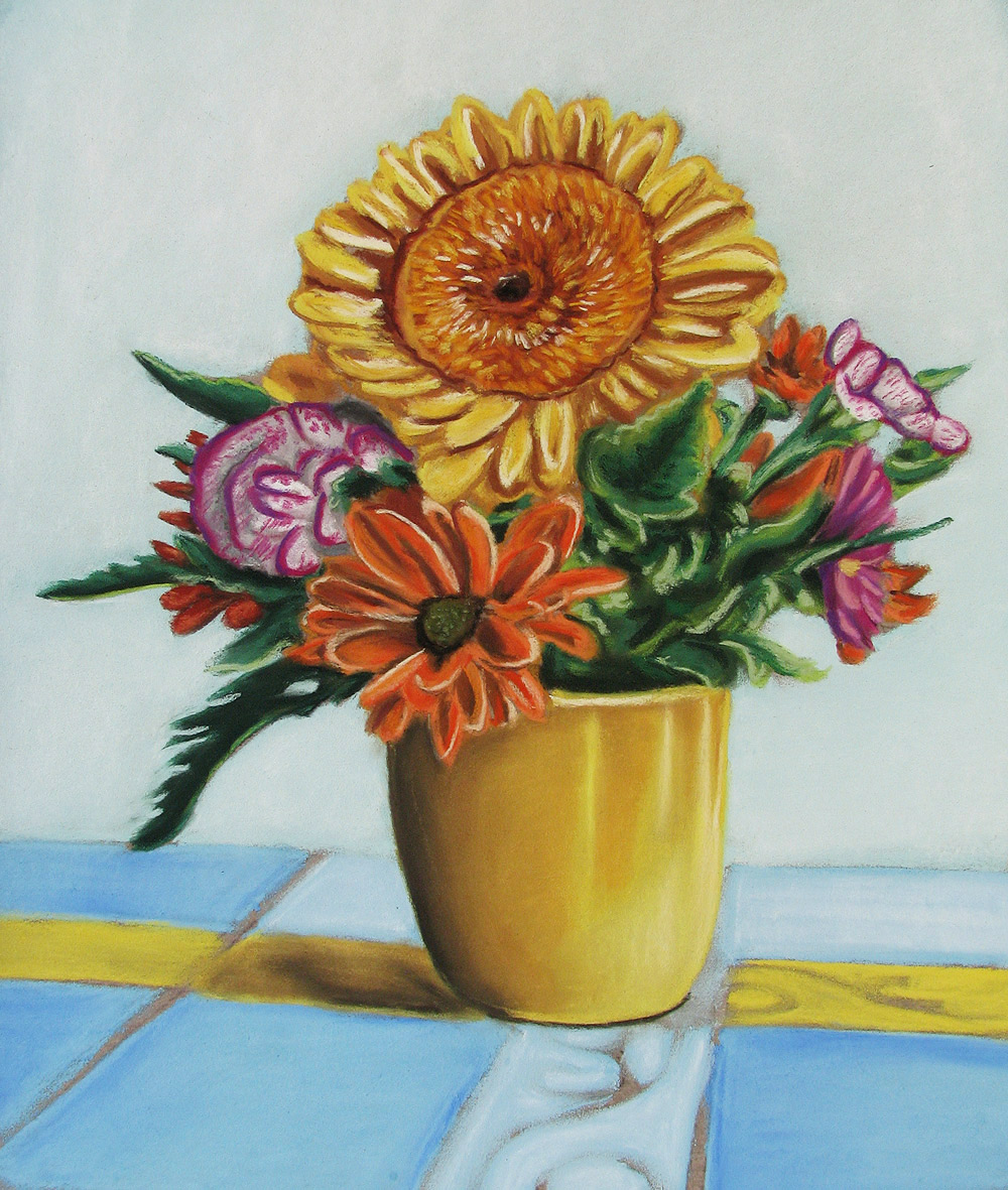
Color Groups
When working with pastels, as with most mediums, it is generally wise to simultaneously focus on areas that fall into the same color group – as shown in the examples to the left.
For instance, even though the white and magenta flowers are not next to each other on the paper, it makes sense to work on them both at the same time. The same can be said for the orange flowers in the image.
One reason why it is smart to work in color groups is because pastels are messy. The pastels will leave colored residue on the artist’s fingers, which will need to be washed off before using the next color. If the artist does not have clean hands when using a new color, then the residue from the previous pastel will taint the color of the new pastel that is being used.
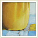
In the image to the left, notice how the vase has been smoothly blended, just like the background, and unlike the flowers. Does the smoothness of the vase feel differently to you than the unblended flowers? Does it create a different sense of texture?
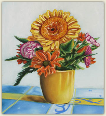
To Fix or Not to Fix?
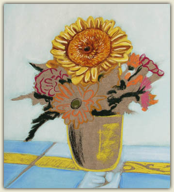
To the right you can see the finished pastel painting. Now that the pastel painting is finished, the question is whether or not to use a fixative. Most art mediums, such as acrylics and watercolors, benefit from using a final sealant, such as a varnish or a spray fixative. A fixative “fixes” the pastel particles in place – otherwise the pastel will always be in danger of being damaged through accidental smudging. Despite this benefit, using a fixative is generally not advisable. The fixative will wet the pastel, resulting in a permanently duller color. The vibrancy of the pastel artwork will then be lost. Instead of spraying a completed pastel artwork, it is better to handle, store and display the artwork with utmost precaution, rather than to risk deadening the colors. Part of the charm and allure of pastel is the rich vibrancy of the pigments, so it is best to keep them that way!
Thank you to Thaneeya McArdle, who contributed this page and based the information upon her work.