
- Choose:
 Chrome orange
 Realgar
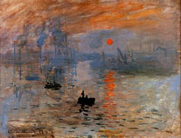
In this Impressionist painting, the sun is set against the dawn, a vibrant orange color rising against the gray setting of its motionless surroundings. The movement’s name was engendered by this Monet paining, “Impression: Sunrise” (1873, Musee Marmottan, Paris), when critics called Monet and his comrades “Impressionists.”
Symbolism of the Color Orange
The color we know as orange was referred to in Old English as “geoluhread,” which means yellow-red. The word “orange” was adopted after the eponymous fruit was introduced to English via the Spanish word naranja, which came from the Sanskrit word nāraṅga. Orange conveys energy, enthusiasm, and balance. It has less intensity or violence than red, and is calmed by the happiness of yellow. The color orange often relates to autumn, when the leaves turn shades of orange and brown. Orange is also tied to Hinduism and Buddhism. In Hinduism, the color orange represents fire, a metaphor for the inner transformation that is experienced by swamis donning orange robes.
Orange is also used for safety purposes as a warning color. Orange can be found on dangerous machinery, high visibility clothing, and traffic cones.
Short History of Orange Pigments
The pure orange pigments realgar and chrome orange were favored by the Impressionists. Less pure tones of orange were found largely in the ochre family and lately in the cadmium family. Cadmium orange is a popular color in oils, acrylics, and watercolors. The more recently developed Azo orange is cheaper than cadmium orange, is non-toxic, and retains the same degree of lightfastness.
The color orange occurs between red and yellow in the visible spectrum at a wavelength of about 585–620 nm. The complementary color of orange is azure, a slightly greenish blue.
|
Timeline of orange pigments. |
|
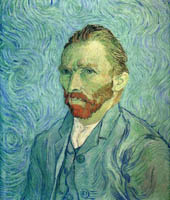
Vincent van Gogh said, “There is no blue without yellow and without orange.” Influenced by prints from Japan, he painted dark outlines around objects, filling these in with areas of thick color. He was aware that juxtaposing complementary colors made each color seem brighter, so he used yellows and oranges with blues and reds with greens. "To exaggerate the fairness of hair, I come even to orange tones, chromes and pale yellow.... I make a plain background of the richest, most intense blue that I can contrive, and by this simple combination of the bright head against the rich blue background, I get a mysterious effect, like a star in the depths of an azure sky." This is exemplified by his self-portrait (1889, Musée d'Orsay, Paris). |
|
The ingredients of Antonio Stradivari’s orange varnish remain a mystery to this day. Stradivari was a renowned maker of stringed instruments in 18th century Italy, and 300 years later his violins can fetch $2-3 million at auction. It is now believed that the orange varnish is what gives Stradivarius violins their exquisite sound. |
|
Although madder is commonly associated these days with pink and red, it can also be used to create orange. Madder roots, when heated in a vat and mixed with a mordant such as alum, can be used to create a deep orange dye. The color intensity of the dyed fabric will fade over time through repeated exposure to sunlight and environmental elements, but if well-preserved, the brilliant orange can last for centuries. |
|
"Flaming June" by Lord Frederic Leighton, 1895. This Victorian era painting depicts a sleeping woman wearing a flaming orange dress. Painted in a classical style, "Flaming June" celebrates the vibrancy of the color orange contrasted against the main figure’s quiet repose. |
