|
|||||||
|
|
van Eyck Lotto Caravaggio Optics Focal lengths No documentation Arnolfini portrait Talent Problems tracing Demonstrations Technology Future discussions Summary The rise of oil paint, surfaces versus contours, and the role of colorIt is curious that Hockney gives scant consideration to one of the most important developments in western art, which occurred just about the time they hypothesize optical elements were introduced: the rise in the use of oil paints. Compared to previous media such as mastic, cera colla, fresco or egg tempera, oil paints have a greater range in saturation (purity of color), in lightness (whiter whites, blacker blacks) and several specific colors, such as saturated yellow (from tin-lead yellow oxide). Van Eyck, whom Hockney and Falco enlist in support of their theory, has been called "the father of oil painting," and for good reason.
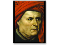
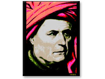
A Man 2. "De-opticalized" version As Hockney points out, this 1620 Campin portrait is indeed remarkable for its "opticality." But might that not be due more to subtleties in shading, color and highlighting rather than accurate depiction of the contours, that is, rendered surfaces rather than contours? This hypothesis is admittedly hard to test, and involves several subjective decisions and thus open to debate. As a very crude first attempt at what would be needed to judge this hypothesis, I "de-opticalized" the Campin portrait in Adobe Photoshop by adjusting the color balance, and contrast. This process leaves the contours virtually unchanged, but alters surfaces, shading and color. Informally, and not surprisingly, this "de-opticalized" portrait appears less "optical" than the original. I freely admit that this rapid and ham-fisted demonstration by someone of meager artistic talent is quite artificial. I do not claim that the "de-opticalized" Campin head is indicative of any specific pre-Renaissance painting. (Such posterization is more reminiscent of some of Andy Warhol's work.) All I am trying to show is that color, shading, contrast, tonal range, and so on have a significant effect upon the "opticality" of a painting. This is a crucial point, because optical projections do not help -- and in most cases hinder -- artists in their quest for such tonal rendering, at least in oil paintings. The projection method of Hockney and Falco is ill-suited to capturing subtleties of surface -- color, chiaroscuro, sfumato, and so on. Because the light is so dim in these projections, colors are harder to distinguish. For instance, the red paint the artist wishes to use appears quite different when illuminated by the red projected light -- the hue, saturation and lightness are changed. Moreover, colors appear different when dim, due to visual processes such as the Purkinje shift. All these reasons show why it extremely difficult to get the colors right by the Hockney/Falco method. Summary: The "opticality" in paintings of this period may be due more to surface, color and shadow than accurate rendering of contours. The projection method impedes rather than aids artists in their efforts to render surfaces. |
| https://www.webexhibits.org/ |