| Relevant paintings: 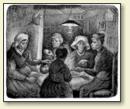
"Lithograph, Potato eaters," Vincent van Gogh
[Enlarge]
|
Dear Theo
Add to this “les anciens ne prenaient pas par la
ligne, mais par les milieux,” that means, starting with
the circular or elliptical bases of the masses, instead of the
contour.
I found the exact words for the latter in Gigoux's book, but
the fact itself had already preoccupied me a long time. I
believe the fuller of sentiment a thing one makes is, and the
more true to nature, the more it is criticized and the more
animosity it rouses, but after all, in the end it will rise
above the criticism.
I was very glad to hear Portier's opinion, but the question
is whether he will stick to it. But I know some of those rare
people who have “foi de charbonnier” do exist, and
don't swing back and forth with public opinion. I am very glad
that he found “personality” in it. In fact, I try
more and more to be myself, caring relatively little whether
people approve or disapprove of it. I don't mean to say that I
don't care whether Mr. Portier sticks to his good opinion; on
the contrary, I will try to make things which strengthen him in
it.
By the same mail you will receive a few copies of a
lithograph. I should like to make, with a few alterations, a
definite picture of the sketch I painted in the cottage. And
that would perhaps be one which Portier could show, or which we
could send to an exhibition. At least it is a subject which I
have felt, and such as it is, I myself could point out, as well
as other critics, its weak points and some absolute
mistakes. But there is a certain life in it, perhaps more
than in some pictures that are absolutely faultless.
I too believe that if Henri Pille had had to decide, Le Chat
Noir might not have refused it.
After all I don't care much, for in order to be quite
independent, I want to learn to make lithographs myself.
If I make a picture of the sketch, I shall make at the same
time a new lithograph of it, and in such a way that the
figures, which, I am sorry to say, are now turned the wrong
way, come right again.
Not to make the letter too heavy, for Mother is writing too,
I'm stopping; I shall write soon again; thanks for your letter.
With a handshake,
Ever yours, Vincent
[Translation of the French pages by Delacroix]
The ancients admitted only three primary colours: yellow,
red and blue, and the modern painters do not admit any others.
In fact, these three colours are the only indissoluble and
irreducible ones. Everybody knows that sunlight is made up of a
series of seven colours, which Newton called primitive -
violet, indigo, blue, green, yellow, orange and red; but it is
clear that the appellation “primitive” cannot be
applied to three of these colours, which are composite, for
orange is got by mixing red and yellow; green, by mixing yellow
and blue; and violet, by mixing blue and red. As to indigo, it
cannot be counted among the primitive colours, for it is only a
variety of blue. So in accordance with antiquity it must be
acknowledged that there are only three colours which are truly
elementary in nature, and which, when they are mixed two at a
time, produce three more composite colours which may be called
secondary, to whit: orange, green and violet.
These rudiments, developed by modern scientists, have led to
the conjecture of certain laws that form an illuminating theory
of colours, a theory which Eugène Delacroix commanded
scientifically and thoroughly, after grasping it instinctively.
(See his Grammaire des arts de dessin, 3rd ed.
Renouard.) If one combines two of the primary colours, for
instance yellow and red, in order to produce a secondary colour
- orange - this secondary colour will attain maximum brilliancy
when it is put close to the third primary colour not used in
the mixture. In the same way, if one combines red and blue in
order to produce violet, this secondary colour, violet, will be
intensified by the immediate proximity of yellow. And finally,
if one combines yellow and blue in order to produce green, this
green will be intensified by the immediate proximity of red.
Each of the three primitive colours is rightly called
complementary with regard to the corresponding secondary
colours. Thus blue is the complementary colour of orange;
yellow, the complementary colour of violet; and red, the
complementary colour of green. Conversely, each of the combined
colours is the complementary colour of the primitive one not
used in the mixture. This mutual intensification is what is
called the law of simultaneous contrast.
When the complementary colours are produced in equal
strength, that is to say in the same degree of vividness and
brightness, their juxtaposition will intensify them each to
such a violent intensity that the human eye can hardly bear the
sight of it.
And due to a singular phenomenon, the same colours which
strengthen each other by their juxtaposition will destroy each
other when they are mixed. So if one mixes blue and orange
in equal quantities, the orange will be as little orange as the
blue is blue, the mixture destroys the two tints, and there
emerges an absolutely colourless grey.
But if one mixes two complementary colours in unequal
proportions, they only partially destroy each other, and one
gets a broken tone, which will be a variety of grey.
This being so, new contrasts may be born of the juxtaposition
of two complementary colours, one of which is pure and the
other, broken. As the fight is unequal, one of the two colours
gains the victory, and the intensity of the dominant colour
does not preclude the harmony of the two.
Now, if one brings together similar colours in a pure state
but in different degrees of intensity, one gets another effect,
in which there will be a contrast through the difference in
intensity and at the same time harmony through the similarity
of the colours. Finally, if two similar colours are placed next
to each other, the one in a pure state, the other broken, for
instance pure blue and grey-blue, another kind of contrast will
result, which will be toned down by the analogy. So it is clear
that there are various means, divergent among themselves, but
equally infallible, by which to intensify, to maintain, to
weaken or to neutralize a colour's effect, and this by its
reaction to the contiguous tones - by its touching what is not
itself.
In order to intensify and to harmonize the effect of his
colours he used the contrast of the complementary and the
concord of the analogous colours at the same time; or in other
terms, the repetition of a vivid tint by the same broken
tone.
At this time, Vincent was 32 year oldSource:
Vincent van Gogh. Letter to Theo van Gogh. Written c. 13-17 April 1885 in Nuenen. Translated by Mrs. Johanna van Gogh-Bonger, edited by Robert Harrison, number 401.
URL: https://www.webexhibits.org/vangogh/letter/15/401.htm.
This letter may be freely used, in accordance with the terms of this site.
|